
Chicago Park District App
Mobile Design

Overview
For a mobile design course, I had to pick a website and two scenarios that demonstrated the most important functionality. I chose the Chicago Park District website and designed a mobile native prototype for park patrons in order to help them find and register for programs near their neighborhood.
Team
Solo
Strategies
UX Design, Prototyping, Visual Design
Timeline
One week
Tools
Figma
The Problem
The problem is twofold: the Chicago Park District doesn’t have a native application for its users and the existing mobile site wasn’t user focused. The mobile site doesn’t hep user with the tasks they want to accomplish and provide too many options which can cause cognitive overload.
Goals
Create a more seamless and efficient experience for park patrons in order to help them find and register for programs near their neighborhood.
Refer to the Human Interface Guidelines and utilize their patterns.
Explore Chicago Park District
The first screen shows users the latest news related to the Chicago Park District. They can tap on the news to read more about that specific headline. At the bottom of the screen, I included a tab bar where users can navigate more easily. If users want to find a program at a park near their neighborhood, the user can tap on the search icon and it’ll take them to the search screen.
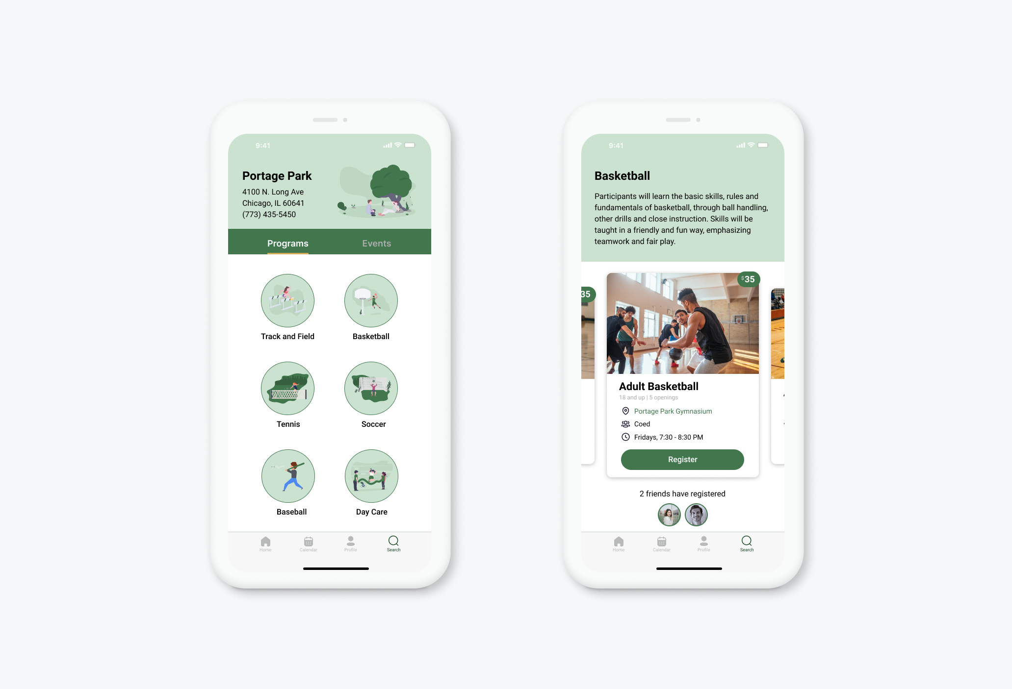
The search screen provides users with the ability to search for parks, programs and events. The app uses the user’s location to recommend parks near their home. At the bottom, the app also provides a list of featured programs. In this example, the user will tap on Portage Park which is one of the closest parks to the user’s home.

Find Programs
After the user taps on their desired park. The user can now choose what program they would like to view. In this case, the user wants to find a program for basketball. The user would tap on basketball. This will take the user to Portage Park’s basketball program page where they will be able to view more information about the program. The designs of the screens are kept simple, with a clean white background and the Chicago Park District’s official colors. I wanted to give the page a Chicago park feel, so I included illustrations of park activities throughout the app.
Register
Many park patrons are now utilizing the website to register online due to the pandemic and there’s a stronger push from the organization to make the registration process available online. Therefore, the second scenario I chose to focus on was the registration process for an existing user. The existing registration process online was complicated and lacked clear direction for users.
Registering for a program is now much easier as users can tap on the register button to register for the basketball program. It’ll take them to a payment page where they can either use their existing form of payment or add a new one. In this case, users can add their apple pay information and tap on continue. The user can now complete their registration by tapping on confirm. The user was able to register for a program in just a few taps as the app uses their existing information to make the registration process more efficient. At the end, the user receives a confirmation that the registration was completed. They are instructed in simple language of the next steps: the user can either add the program to their calendar, view program details or return to the home page.
